


Ever noticed how many fashion brands are ditching elaborate crests and ornate fonts for something… simpler? You’re not alone. Minimalist logos are having a profound moment in the spotlight. But does stripping things back actually work? Let’s dive into the world of fashion branding and see if less really is more.
The Rise of Fashion Brand Minimalist Logos: A Visual Trend
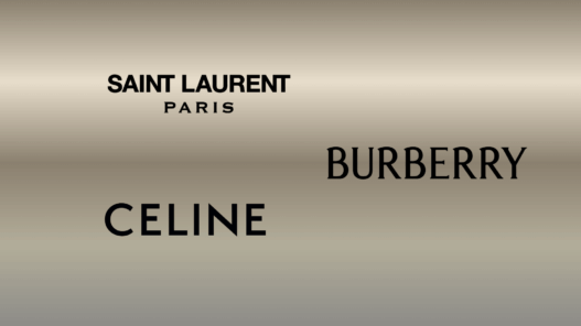
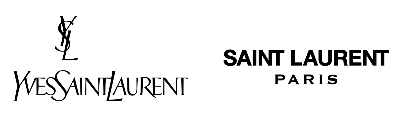
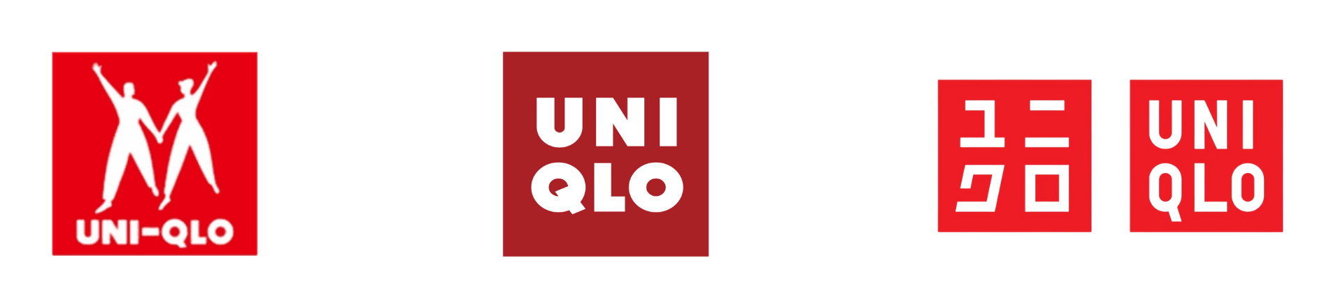
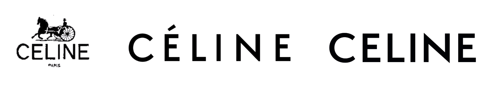
From the high street to high fashion, streamlined logos are everywhere. Think of the sans-serif simplicity of Saint Laurent, the pared-down elegance of Celine, or the instantly recognisable, clean lines of Uniqlo. Gone are the days of fussy embellishments. Instead, we’re seeing a focus on clean typography and uncluttered design. This visual trend reflects a wider societal shift towards minimalism, valuing simplicity and clarity.
So, what exactly is a minimalist logo? It’s all about reducing a design to its most essential elements. Think clean lines, limited colour palettes, and a focus on typography or a single, impactful symbol. The aim is to create a logo that is memorable, versatile, and instantly recognisable, even at small sizes. It’s about conveying a brand’s identity with the fewest possible visual components.
Decoding the Psychology Behind Fashion Brand Minimalist Logos
Why are minimalist logos so popular with fashion brands? A big part of it is psychology. Minimalist designs often evoke feelings of sophistication, modernity, and exclusivity. The simplicity can project an image of confidence and timelessness. By removing unnecessary clutter, brands can communicate a sense of clarity and focus, suggesting they are confident in the quality of their product and don’t need to shout about it. Research suggests that consumers associate minimalist aesthetics with higher quality and premium brands. The brain finds simple things easier to process, leading to quicker recognition and positive associations.
Case Studies: Successful (and Unsuccessful) Minimalist Logos in Fashion
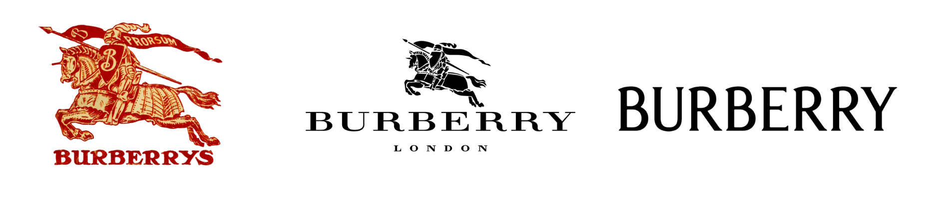
Let’s look at some examples. Burberry’s 2018 rebrand, replacing its iconic equestrian knight with a bold, sans-serif font, initially sparked controversy. However, it modernised the brand, appealing to a younger audience.
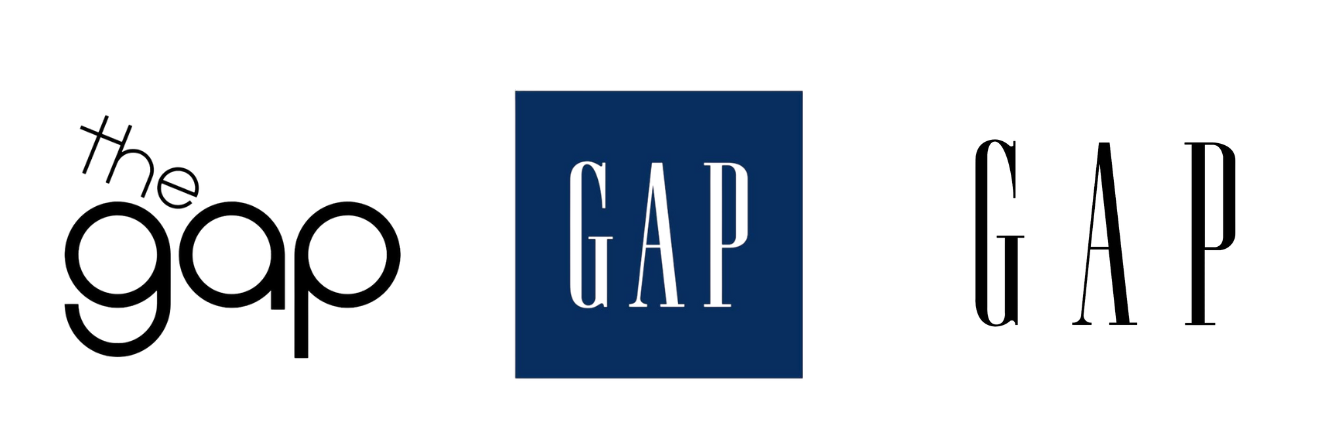
On the flip side, Gap’s disastrous 2010 logo change, swapping its classic blue square for a generic sans-serif font, was met with widespread derision and quickly reverted. Why? It lacked any connection to the brand’s history or identity and felt utterly bland.
The Pros and Cons: Is a Fashion Brand Minimalist Logo Right for You?
Minimalism isn’t a guaranteed win. Here’s a quick breakdown:
Pros:
- Timelessness: Simple designs are less likely to become dated.
- Versatility: Minimalist logos work well across various platforms and sizes.
- Memorability: Clean designs are easier to recall.
- Perceived Quality: Can convey sophistication and luxury.
Cons:
- Lack of Distinctiveness: If not executed well, it can look generic.
- Potential for Blandness: Stripping away too much can remove personality.
- Difficulty in Conveying Brand Story: More creative solutions might be required to communicate the brand’s values.
- Trend Dependency: As trends evolve, previously “minimalist” logos may appear outdated.
The Future of Fashion Branding: Beyond Minimalism?
While minimalism currently dominates, the pendulum might swing back. We could see a return to more expressive and detailed designs in the future. Some brands are already experimenting with bolder colours, playful fonts, and more intricate imagery. However, the core principles of good logo design – clarity, memorability, and relevance – will remain crucial, regardless of the prevailing aesthetic.
Ultimately, a fashion brand’s minimalist logo can be incredibly effective, but it needs to be done right. It’s not just about stripping things back; it’s about creating a design that is both simple and meaningful, representing your brand’s identity in a clear and impactful way. It’s about asking yourself: What is the core message I want to send?